From Drop-Off to Conversion
Redesigning a long multi-step onboarding process to reduce abandonment and improve trust through clearer structure, guidance and transparency.
00

problem
Users were required to complete a long multi-step application process involving a large amount of personal and sensitive information in order to participate in an educational programme. The experience lacked clear structure, visible progress and contextual guidance, creating confusion, distrust and high abandonment rates. The challenge was to improve completion without removing any required information or simplifying the legal and operational complexity of the process.
solution
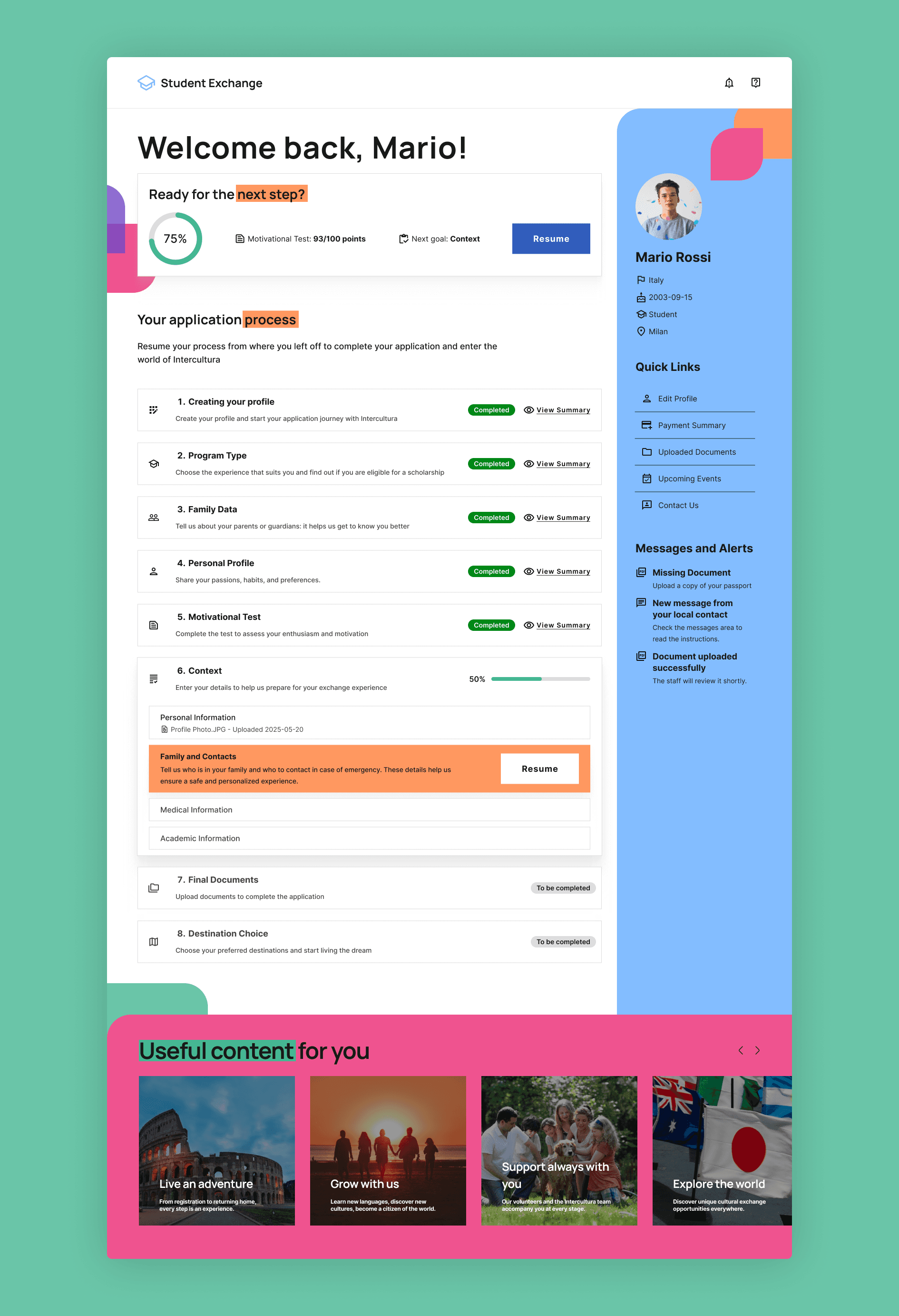
I redesigned the full onboarding experience from scratch, restructuring the application into clearer stages with visible progress indicators, improved information hierarchy and more guided multi-step interactions. To reduce hesitation around sensitive data requests, I introduced contextual explanations that clarified why specific information was needed at key moments throughout the flow, helping make the experience feel more transparent and trustworthy.
Collaboration & Process
The redesign required balancing user needs with strict operational and data collection requirements, meaning the focus was not on reducing the number of steps, but on improving how users perceived and navigated the process.
I also designed a supporting dashboard experience that helped users track progress, understand pending actions and maintain orientation throughout the application journey. Every design decision was centered around reducing cognitive load and making the process feel more manageable despite its inherent complexity.
Key Learnings
One of the biggest learnings from the project was understanding how strongly transparency influences user trust and completion behavior. Clearly explaining the purpose behind sensitive information requests significantly reduced hesitation during critical moments of the flow.
The project also reinforced how important structure and progress visibility are in long-form experiences. Breaking complexity into clear stages, reducing unnecessary decisions and continuously guiding users through the next step proved essential in maintaining engagement and reducing drop-off.
year
2025
timeframe
25 Days
tools
Figma
category
UX/UI
01

02

see also


