Refueling in Real Time
Designing a real-time fuel payment experience that reduced friction at the pump while increasing retention through integrated cashback rewards.
00

problem
A fuel station client needed a mobile-first payment experience that allowed users to pay for fuel directly from their phones without leaving the car, using physical terminals or waiting in line. The challenge was designing a fast and intuitive flow that could work in real-time, outdoors and under low-attention conditions, while also integrating a cashback system capable of driving loyalty without introducing friction into the payment experience.
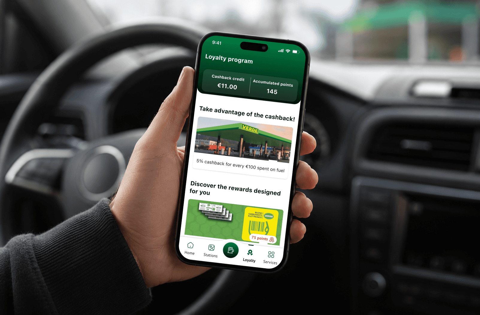
solution
I designed the full mobile payment and loyalty experience, structuring the interaction around a simple guided flow: select station, confirm pump and authorize payment, supported by clear feedback and confirmation moments throughout the journey. In parallel, I integrated the cashback system directly into the core experience, allowing rewards to accumulate automatically and surface naturally inside the wallet experience rather than as a separate loyalty feature.
Collaboration & Process
Because the project was developed as a short-term concept proposal within a two-week timeline, prioritization became a critical part of the process. Every interaction had to justify its presence within the flow, forcing fast decision-making and a strong focus on the essential user journey.
The project also required balancing business goals with real-world user behavior in a highly contextual environment. Designing for fuel stations meant considering cognitive load, weather conditions, time pressure and mobile usability simultaneously, ensuring the experience remained clear and actionable even during fast, interrupted interactions.
Key Learnings
One of the biggest learnings from the project was understanding how critical trust and clarity are within payment experiences. Users are more tolerant of additional steps when the system communicates clearly, confirms actions transparently and reduces uncertainty throughout the journey.
The project also reinforced the importance of ruthless simplification in time-sensitive contexts. In environments where attention is limited, every unnecessary interaction becomes a potential drop-off point, making clarity, feedback and contextual usability more valuable than simply reducing the number of screens.
year
2025
timeframe
20 Days
tools
Figma
category
UX
01

see also


